Confidence arrives before comprehension. A chart that is easy to read feels like a chart you have understood.
This week I spoke to a friend whose startup will have to deal with this problem in the next year or so. We discussed how their users might find it difficult to understand the app’s data, and, as a result, I ended up investigating the behavioural science of how we process and interpret it. There are surely a few things that need clarification.
You’ve probably come across a statistic that humans can process visual information 60,000 times faster than text.
It’s an amazing figure, but it has never been linked to a study.
The myth persists because it combines a psychological error with an attractive presentation. It associates pre-attentive visual detection – the millisecond it takes your brain to notice a bright red dot – with semantic comprehension, which requires considerable cognitive effort to understand what that dot means for your business. In this way, it presents two distinct brain functions as if they were a single metric.
This error in miniature explains a much larger confusion. When we argue about what makes a chart “effective”, we are in fact having four different arguments at the same time.
The four distinct outcomes
When you show a user a dashboard, you are asking them for one of four outcomes:
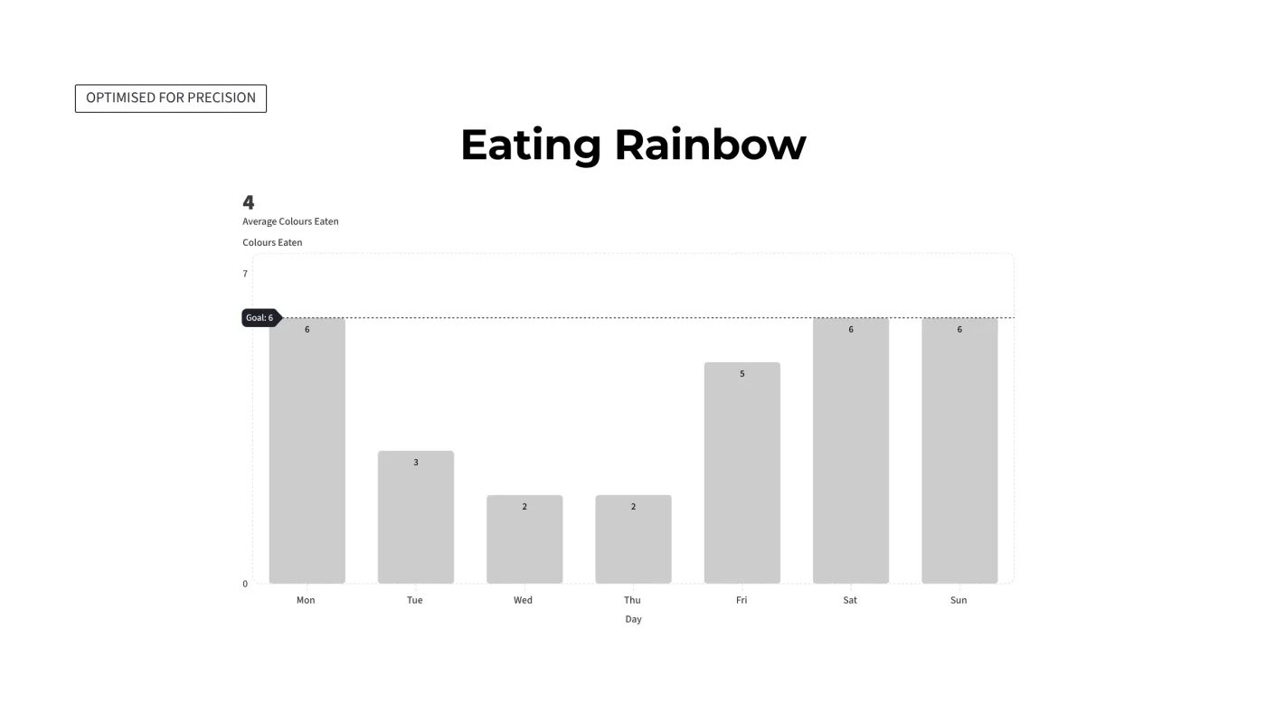
Precision: Finding an exact numerical value.
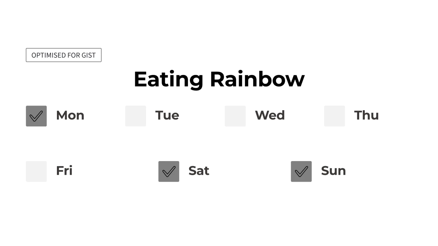
Gist: Grasping the overall trend or relative size.
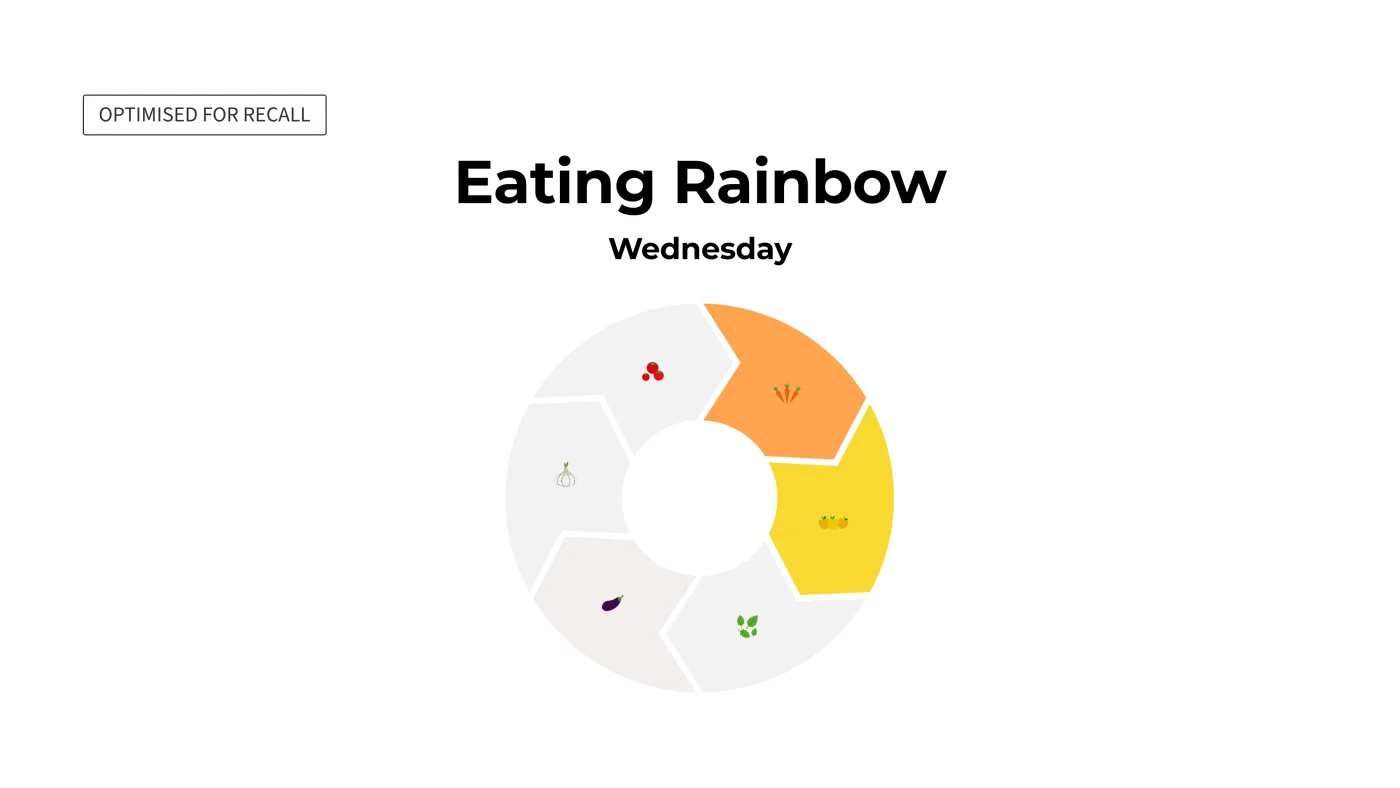
Recall: Remembering the data a week later.
Behaviour Change: Altering a real-world habit based on the information.
The majority of advice given on design focuses on only one of these aspects and treats it as the general rule. When precision is the aim, all unnecessary ink is eliminated. This approach is based on research carried out by Cleveland and McGill in 1984 and was later confirmed by Heer and Bostock in 2010 using crowdsourced samples, showing that our brains are most effective at assessing positions on a common scale.
Precision. Seven days, seven bars, every value labelled. You can read Wednesday exactly.
If you want gist, minimalism alone is not enough; you must design for pre-attentive processing. Research by Haroz and Whitney shows that users are only able to instantly identify trends or clusters when the number of data categories is kept below six. If that limit is exceeded, the brain gives up on rapid pattern recognition and instead resorts to a labouring and tiring search.
Gist. Two states rather than seven values, so the pattern arrives before you’ve decided to look for it. You lose the numbers entirely – and you were never going to use them.
And if you want recall, standard advice fails entirely. A 2010 study by Scott Bateman demonstrated that heavy visual embellishment – using quirky illustrations and metaphors – actually provides the cognitive “hooks” needed for long-term memory.
A necessary caveat for the data purists: the Bateman study is widely disputed within academic circles because it was based on a sample of only 20 participants. Nevertheless, later, more extensive research has consistently confirmed that high visual distinctiveness actually fixes the data in our long-term memory.
Recall. Embodied imagery anchors the data to memory; the faded wedges say what’s missing without a single number.
The guidance appears to contradict itself since the objectives are in conflict. It is impossible to design with an aim to recall by applying the principles of precision.
The danger of a beautiful chart
When we get this wrong, the result is rarely that the user simply does not understand the chart. It’s more dangerous than that: they misunderstand it, and feel certain they’ve read it correctly.
This is what psychologists refer to as the Illusion of Explanatory Depth (IOED).
When a chart is highly polished and aesthetically pleasing, it creates a “fluency effect”. Because the graphic is so easy on the eyes, the user’s brain subconsciously assumes the underlying data and causal mechanisms must be equally simple.
This visual distortion happens far below the level of logical reasoning. In 2021, Yang and colleagues tested how people react to truncated bar charts – where the axis does not start at zero. They explicitly warned the participants about the visual trick in advance, but this warning had little effect. Even more remarkably, quantitative PhD students were just as susceptible to the distortion as everyone else.
The visual refinement gives a false sense of fluency; that fluency in turn leads to misplaced confidence. And you cannot fix it by explaining the chart better, since the perceptual distortion bypasses our higher-order logic. You have just made your user more certain and more wrong at the same time.
We must also factor in the baseline reality of the audience. Foundational research using nationally representative samples in the United States and Germany found that 35% of the US sample and 33% of the German sample had both low numeracy and low graph literacy. Even the cleanest standard bar chart will fail a third of your users because they lack the cognitive profile to decode it.
The hardest case: when the data is the user
This brings us to the most difficult terrain in product design: self-tracking.
When you build a fitness streak, a financial health dial, or a sleep tracker, you are not just transferring information anymore but are instead carrying out a psychological feedback intervention.
The popularity of wearable sleep trackers, for example, fostered a condition called orthosomnia – an unhealthy obsession with achieving perfect sleep metrics as detailed in a 2017 case series by Baron and colleagues. In extreme cases of metric gaming noted by the researchers, users will lie perfectly still in bed while awake, hoping to trick the device into recording more sleep time, directly contradicting good sleep hygiene. Or look at learning apps that rely heavily on daily streaks: they shift users’ focus away from learning a language toward gaming the system by doing the bare minimum just to maintain their visible score.
When data describes the person reading it, a broken streak or a low score can threaten the user’s self-concept, which causes data traumatisation. When your product shames a user for being human, their response is to protect their ego by avoiding your app entirely. They do not take corrective action; they just silent-quit.
To fix this, we have to design for cognitive flexibility rather than rigid compliance. When Apple introduced “Pause Rings” in watchOS 11, it enabled users to pause their daily goals while being unwell without breaking their long-held streak – a crucial psychological guardrail against disengagement. Similarly, Strava counteracts the pressure of objective social tracking by allowing athletes to log their subjective perceived exertion. This grounds the data in the user’s reality, helping prevent overtraining.
Behaviour change. One prompt, not an overview. Almost there rather than failing, and something to do about it in the next ten minutes.
The behavioural architecture brief
The most common trap of founders and product teams is building a dashboard because it seems “normal” to have one. We throw charts onto a screen, polish the UI, and assume the data will speak for itself.
It’s not that easy. Data visualisation is not a passive window into reality; it is an active, argumentative structure.
Before you hire a designer to create your analytics view, ask yourself one question: What should the reader do next?
If you are building an operational tool where analysts need precision to catch server errors, use strict minimalism. If you are designing an executive overview where leaders need the gist at a glance, keep categories under six so the brain can pre-attentively cluster them. If you are building a consumer app where users need recall to save money, use visual distinctiveness and metaphor. And if you are feeding users their own behavioural data to drive change, drop the abstract aggregate scores that trigger defensive gaming, and frame the data around actionable, flexible interventions.
Instead of questioning whether your charts look sleek, ask what behaviour they might inadvertently encourage.
Yana Varankova
Principal UX Researcher & Strategist
Yana bridges the gap between "building a product" and "building a habit." Blending an MSc in Psychology with AAA gaming experience and having worked on titles like World of Tanks and Dead Island 2, she blends behavioural design with game mechanics to secure retention from the early days. Currently leading UX Strategy at a Scottish HealthTech startup and mentoring via UoE Edinburgh Innovations and Heriot-Watt GRID, she translates cognitive science into product architecture with her Deep Retention framework.